

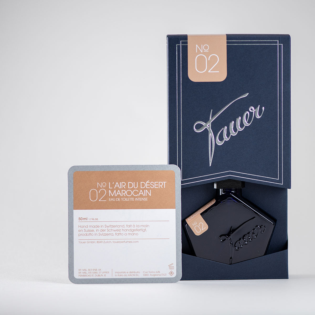
I’ve had this packaging for more than two years the dark blue box with the sliding insert and silver-embossed Tauer logo. It’s become part of how people recognize my perfumes. And while it’s not an absolutely new design, I think it’s worth taking a moment to share what went into it and why I’m so happy with it today.
The boxes are made here in Switzerland, using sustainable production methods wherever possible. I worked with one local print and packaging partner, Voegli AG, who understand the importance of quality, and who share my love for traditional techniques. Together with my design guru for many years, Donovan, from the Designer's Club in Zurich, who has an eye for every smallest detail, we worked on the perfect design for my packaging. The boxes are printed on old Heidelberg machines wonderful, reliable presses that give the print a tactile beauty you can feel. The silver embossing adds just the right touch of elegance, without shouting.

I went for a smart folded structure that holds together almost without glue, and slides open with a little motion almost like opening a drawer. Inside, the pentagonal flacon fits snugly, held in place with care. It’s not just about looks the design also offers good protection during shipping, and it avoids excess material.
The color is a deep, slightly textured blue that I’ve grown very fond of. Over time, it’s come to feel like part of my brand’s visual language.
A little side note: the box design received the Swiss Print Award, which I didn’t expect but it was a lovely moment of recognition for something that’s usually working quietly in the background.
So while the box might be familiar, there’s more to it than meets the eye. I just wanted to share that a small insight into something that quietly supports what I do, day after day.
Thanks for reading.
Andy